elearning platform · react, tailwind, rest apis
LearnNova
An e-learning platform built around the part that usually gets neglected: staying with a course to the end.
Overview
Courses are easy to start and easy to abandon
Structure that carries a learner through
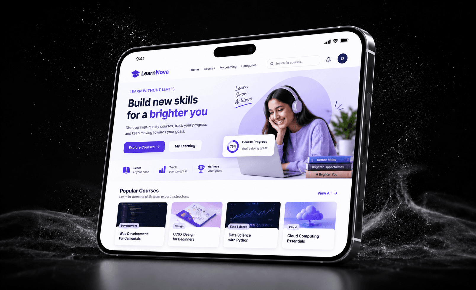
LearnNova organises catalogue, course detail, lesson playback and progress into one React interface. Progress is visible on every screen a learner touches, so picking a course back up after a week never starts with a hunt for where they left off.
The problem
Online courses are easy to start and easy to abandon. The failure is rarely the content — it is that returning after a week begins with a hunt for where you left off.
The goal
Organise catalogue, course detail, lesson playback and progress into one interface where a learner can always see where they are, and get back to it in one action.
How it was built
- 01Discovery
Following one learner end to end
Rather than designing screens in isolation, the flow was drawn as a single path — browse, enrol, learn, resume — and each screen judged by whether it moved someone along that path or stalled them.
- 02Development
A component system that scales with the catalogue
React and Tailwind CSS carry a small set of reusable primitives — cards, filters, players, progress — consumed by every view and fed from REST APIs. Adding a course category is a data change, not a new page.
- 03Strategy
Responsive as a requirement, not a pass at the end
Learners move between phone and laptop mid-course, so every layout was built fluid from the first commit instead of being retrofitted with breakpoints once the desktop view looked right.
Project details
- Role
- Front-end design and development
- Type
- Web platform
- Stack
- React, Tailwind CSS, REST APIs
Key features
- Course catalogue with filtering
- Course detail and lesson playback
- Progress visible on every screen a learner touches
- Reusable component set — cards, filters, players, progress — fed from REST APIs
- Fluid layouts built responsive from the first commit
Challenges
Designing the path, not the screens
Screens designed in isolation produced a catalogue that looked fine and a journey that stalled. Drawing the flow as one path — browse, enrol, learn, resume — and judging each screen by whether it moved a learner along that path changed which screens were needed at all.
Keeping it legible as the catalogue grows
A small set of primitives consumed by every view means adding a course category is a data change rather than a new page — which is what stops an interface degrading as content is added to it.
The Result
A learning interface that stays legible as the catalogue grows, and keeps a learner’s place visible on every screen they land on.
What I learned
Building responsive from the first commit was cheaper than retrofitting breakpoints once a desktop view already looked right. And the component system paid for itself the moment the catalogue grew: the constraint that everything reuse the same primitives is what kept the interface coherent.
Want something like this built?
Tell me what you have in mind and I will come back with a plan, a timeline and a price.